Nexus S and Android 2.3 Review: Gingerbread for the Holidays
by Brian Klug on December 14, 2010 4:08 PM EST- Posted in
- Smartphones
- Samsung
- Nexus S
- Gingerbread
- Android 2.3
- Mobile
It’s hard to know where to start with the Nexus S, as there’s so much going on so fast in the smartphone space, and especially on the Android side of the smartphone market. To put it in perspective, the Nexus One is just shy of one year old, and yet the hardware already feels like it’s in dire need of an update. That’s not to say that the one-year cadence is too short - it isn’t - but just to put things in perspective.
Back when it launched, one of the primary goals of the Nexus One was to make phone shopping carrier-agnostic. Shop around for the cheapest service (or the best coverage and speed, depending on your priorities), then bring your own unlocked phone and enjoy. Since there’s no early termination fee, you could turn around and sell the phone a few months down the road, and use that money to upgrade before you’d normally be eligible. It’s not a foreign concept to the rest of the world, but for whatever reason isn’t viable in the US.
Turns out those reasons were simple - people want carriers to provide first-party support for devices, and people want to play with devices in stores before making the jump. Enthusiasts didn’t care and bought the phone anyways. Mainstream sought out whatever carriers had in their retail stores - branded devices with skins, mass-media marketing, and devices with lots more advertising. Months later Google CEO Eric Schmidt announced there wouldn’t be a Nexus Two, and Google shuttered the Nexus One online store a little while after, though you could still buy one if you were a developer. And somewhere between all that, the Nexus One’s purpose really changed.
The purpose was obvious - stock Android running the absolute bleeding edge version possible, carrying with it the latest iteration of Google’s vision of handheld mobile computing. Since then, if you’ve wanted to keep abreast of the bleeding edge of Android, you basically needed to have a Nexus One.
There has been a steady stream of flagship Android devices since the Nexus One, and it’s finally time to update that hardware. This time around the marketing message mirrors what the Nexus One morphed into - buy this handset, and you’re getting the stock Google Android experience with no carrier branding, fast software updates without vendor overhead, and a few new things such as near field communication hardware support. With that out of the way, let’s dive into the hardware and then Android 2.3.
Meet Nexus S
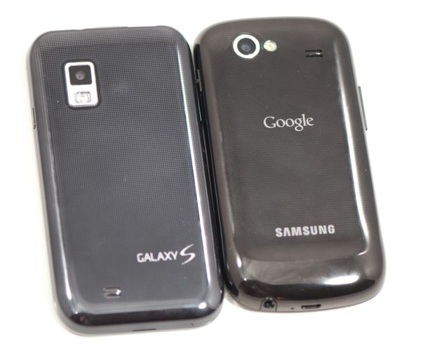
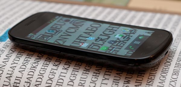
Right off the bat it’s extremely obvious that the Nexus S draws a lot of design language from the Samsung Galaxy S line of devices - Samsung is quite literally the S in Nexus S.
The two share the same 4” AMOLED display, and (love it or hate it) the same glossy plastic case. In the hand, the Nexus S feels almost identical to the Vibrant or Fascinate - they’re both very light (though the Nexus S is about 12 grams heavier), and fit in your palm almost the same way.
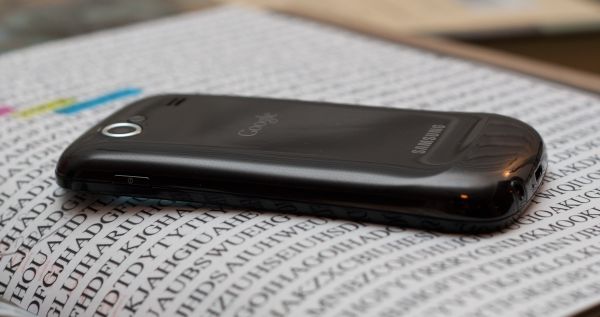
I bring up the back material because again it still strikes me as an odd choice. It shows fingerprints, can feel slippery, and honestly is just hard to rationalize compared to soft-touch devices like the Nexus One. The Nexus S backside has a raised ridge at the bottom, which in the hand sits naturally below your pinky. It’s an ergonomic touch that has the advantage of not letting the back get scratched up when placed back-down on a table, but adds thickness.
Also on the back are the camera and LED flash, the same shape speakerphone port as the Galaxy S, and prominent Google and Samsung branding.
Button placement on the Nexus S also reminds me of the Galaxy S devices. The left side has the volume rocker, the right has the power button. On the Nexus S these buttons are slightly raised and are a bit easier to locate with your fingertips. The volume button has a bit of play but not enough to unnerve. I maintain that placement is perfect - held in my left hand, the power button rests just under the index finger, and volume rocker rests under the thumb. If you carry in the right hand, the power button is under the thumb (though a bit harder to locate) and the volume rocker is under the index finger.
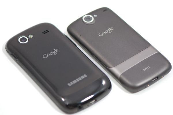
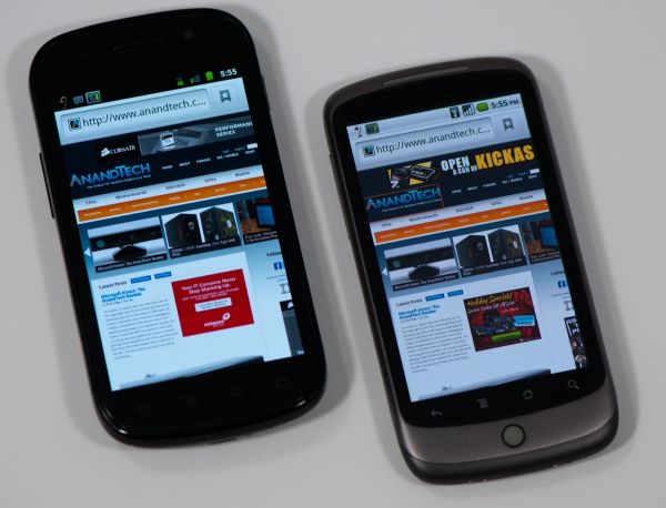
The most interesting comparison for the Nexus S is the original Nexus One. Side by side, you can see how the Nexus S emulates the rounded-corners shape and form factor, it’s just scaled up appropriately to fit a 4” display. The chromed edge around the camera remains the same, and the LED flash is also similar in appearance. It’s really obvious that Samsung and Google put a lot of effort into making sure that while the Nexus S was something different, it didn’t totally sacrifice the Nexus One’s original design language.
Along those lines, the Nexus S puts the microUSB port in the center at the bottom, though the headphone jack is also relocated to the bottom. In fact, probably my only gripe about the Nexus S design is this awkward placement for the headset jack. I guess that’s a silly thing to take issue with, since you can just stick the device in your pocket upside down, but then again nearly every other smartphone puts that jack up on top.
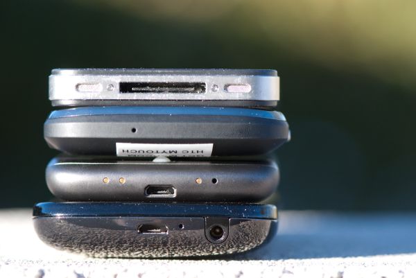
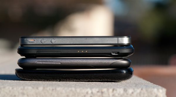
Top to bottom: iPhone 4, myTouch 4G, Nexus One, Nexus S
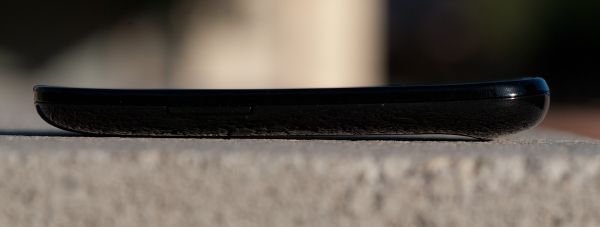
Where the Nexus S differs the most from other phones is its curved front face and glass screen which Google calls the “Contour Display.” The curvature is a very subtle concave one - in reality the total sag is only about 2 mm - which gives a radius of curvature of about 4 meters. Again - subtle, but noticeable. It’s only curved in the vertical direction however, not horizontal (or convex) like the Dell Venue Pro.
What’s interesting is that most of the active region of the display is relatively flat, it’s only when you get out to the edges that the phone is curved. You can really tell when looking at your reflection in the glass. In that sense, the contour display is probably more of a hyperbolic shape than spherical one, but I won’t bore you with some discussion about conic sections. The end result is that when you’re swiping your finger around on the curved display there isn’t any noticeable resistance or change in depth like I’ve noticed with other shaped-display devices. Holding the Nexus S to your face while in a call, that curvature is somewhat helpful but nothing life-changing. Overall it’s just impressive to see such a large unbroken curved glass display.
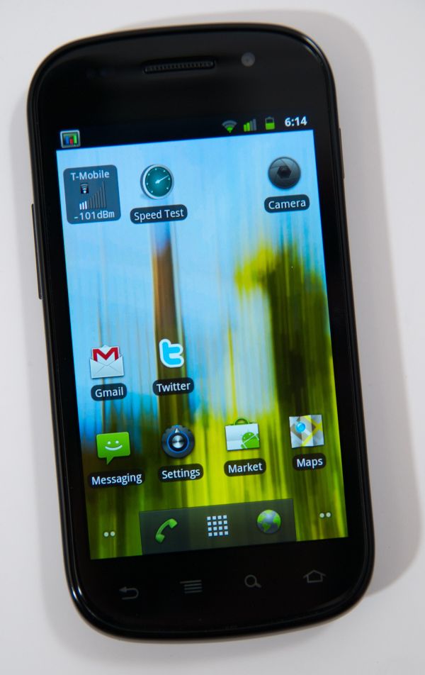
The front-facing camera sits in line with the earphone grille off to the right, on the left side are proximity and ambient light sensors in the same order as I saw on the Fascinate. It’s awesome to see no branding on the front of the device from either Samsung or Google. At the very bottom are the four Android buttons, all of which are unfortunately in yet another different order. On the Nexus S, the order is back, menu, search, home, whereas on the Nexus One it’s back, menu, home, search. On the Fascinate, it’s menu, home, back, search. It’s unfortunate the Nexus One and S couldn’t share the same order, especially since search being at the far right has pretty much been the only constant among devices.
Under the curved glass surface the Nexus S packs the same 4” Super AMOLED panel as the other Galaxy S devices. The glass surface is given the same oleophobic treatment the iPhone 3GS received.
It’s also interesting to note what’s missing from the Nexus S that the Nexus One had - notably, that much maligned trackball is gone, and with it all notification LEDs. I’m a bit disappointed that directional controls like an optical trackpad or mechanical trackball are absent from the Nexus S. It’s one of those things you don’t miss until you don’t have one. Things like scrollback and sending cursor commands in connectbot (arguably Android’s best SSH application) simply require having some directional controls - there’s no virtual keyboard with arrow keys (edit: except Swype, thanks everyone). Other things like Android’s Quake 3 port, kwaak, are difficult to navigate and impossible to play without that control. Missing the notification LED isn’t a big deal for me personally - I find them to be a nag - but they are functional quick-glance aides. Android doesn’t turn on the display when a new SMS arrives, thus that notification LED is usually the only way to know something new has come in.
We’ve put together our usual comparison table, and in here it’s really apparent how much similarity there is between Galaxy S and Nexus S, unsurprisingly. The subtle changes are in size, shape, and extra features like NFC, front facing camera, LED flash, and of course Gingerbread.
| Physical Comparison | |||||||||
| Apple iPhone 4 | Motorola Droid 2 | Samsung Galaxy S Fascinate | Samsung Focus | Google Nexus S | |||||
| Height | 115.2 mm (4.5") | 116.3 mm (4.6") | 106.17 mm (4.18") | 122.9 mm (4.84") | 123.9 mm (4.88") | ||||
| Width | 58.6 mm (2.31") | 60.5 mm (2.4") | 63.5 mm (2.5") | 65 mm (2.56") | 63.0 mm (2.48") | ||||
| Depth | 9.3 mm ( 0.37") | 13.7 mm (0.54") | 9.91 mm (0.39") | 9.9 mm (0.39") | 10.88 mm (0.43") | ||||
| Weight | 137 g (4.8 oz) | 169 g (5.9 oz) | 127 grams (4.5 oz) | 119 grams (4.2 oz) | 129 grams (4.6 oz) | ||||
| CPU | Apple A4 @ ~800MHz | Texas Instruments OMAP 3630 @ 1 GHz | 1 GHz Samsung Hummingbird | 1 GHz Qualcomm QSD8250 | 1 GHz Samsung Hummingbird | ||||
| GPU | PowerVR SGX 535 | PowerVR SGX 530 | PowerVR SGX 540 | Adreno 200 | PowerVR SGX 540 | ||||
| RAM | 512MB LPDDR1 (?) | 512 MB LPDDR1 | 512 MB LPDDR1 | 512 MB LPDDR1 (?) | 512 MB LPDDR1 | ||||
| NAND | 16GB or 32GB integrated | 8 GB integrated, preinstalled 8 GB microSD | 2 GB, 16 GB microSD (Class 2) | 16 GB integrated | 16 GB Integrated | ||||
| Camera | 5MP with LED Flash + Front Facing Camera | 5 MP with dual LED flash and autofocus | 5 MP with auto focus and LED flash | 5 MP with autofocus, LED flash, 720P video recording | 5 MP with Autofocus, LED Flash, VGA front facing | ||||
| Screen | 3.5" 640 x 960 LED backlit LCD | 3.7" 854 x 480 | 4" Super AMOLED 800 x 480 | 4" Super AMOLED 800 x 480 | 4" Super AMOLED 800 x 480 | ||||
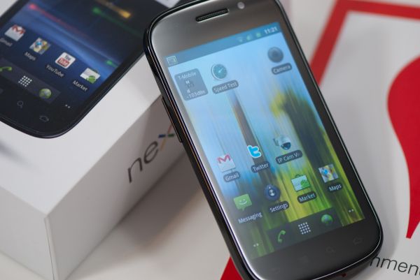
Although we’re told that the Nexus S packaging our Nexus S review unit came in won’t be the same as the packaging it ships with later this week, it’s still worth a look.
It’s very similar in color and design to the old Nexus One packaging (no surprise). White all around with minimal extraneous text, and device up top when opened. Underneath is warranty and health info, and below that is a set of earbuds and charger.




73 Comments
View All Comments
tipoo - Tuesday, December 14, 2010 - link
HTC then Samsung, I wonder who will be next to make a Nexus phone...Motorola, maybe? I think they went with Samsung this round because they have the most capable processor right now.blueF - Tuesday, December 14, 2010 - link
Well the benchmarks show that the current iteration of the snapdragon are on par if not better than hummingbird. I think they chose Samsung for a few reasons, with the most important being they are the OEM of the best amoled screens available. Honestly I would have preferred another HTC nexus due to the superior phone shell. The galaxy phones and their stupid right side lock button is close to a deal breaker for me. Also the head phone jack on the bottom is beyond stupid.vol7ron - Tuesday, December 14, 2010 - link
This was me during this article:"Nexus S... yes, yes.. good stuff. Whoah! Look at that myTouch!"
Can't wait to see that myTouch review, thanks for putting those figures up there.
deputc26 - Wednesday, December 15, 2010 - link
Hmmm where'd the page load times for popular websites vs. other leading phones go?That and battery life are the most relevant benchmarks as to whether or not I buy a phone.
tipoo - Tuesday, December 14, 2010 - link
Yeah, the 1 definitely was constructed better.OscarGoldman - Wednesday, December 15, 2010 - link
"the head phone jack on the bottom is beyond stupid. "Nope, not when the thing lacks an audio line out (which IS stupid). With the jack on the bottom, they can at least make a dock to drop the phone into in your car. That's a lot better than having to plug in a wire that's dangling across your dashboard, every time you want to listen to music.
Reviews need to call these phone manufacturers out for failing to provide an audio line out on the bottom of every phone. Even with the headphone jack on the bottom, you still have to screw around with two volume controls; the one on the phone, and the car radio. And you're running everything through the crappy headphone amp on the phone.
tiredad - Wednesday, December 15, 2010 - link
I'm a little confused by so many reviews being against the jack placement; usually giving the lame reason that it's not what everybody else does. You think Apple thinks that way?I look at my phone to select a track etc. and then i put it in my pocket upside down so the placement is perfect. Not that this is much of a serious matter.
BTW since this is my first post i have to thank this site for providing the most consistent, unbiased and professional reviews i've found to date. When i read a review i want the facts and opinions separated and i don't want any pro one company or another and that's what you give... so cheers guys.
daveloft - Wednesday, December 15, 2010 - link
I prefer the connectors at top so I can throw my phone in the cup holder and not have to put it in upside down.steven75 - Thursday, December 16, 2010 - link
Lack of line-out is one of those things that would be hard to give up if I decided to move from iOS to another mobile OS.I use my iPhone for audio in the car at least twice daily and having line-out audio and charge capability through a single cable is simply awesome.
My stock radio even allows adjusting the level of the aux-in (separate from the volume) so that it matches the volume of all the other sources.
Unfortunately Bluetooth is still a sub-par solution because although you don't need any cables, sound is still inferior quality and you kill your battery on anything but a very short trip.
daveloft - Wednesday, December 15, 2010 - link
Those benchmarks you refer to are probably Quadrant and the reason why a Snapdragon device like the G2 performs better than the Galaxy S was because it had 2.2 while the Galaxy S had 2.1.Also Quadrant scores are heavily influenced by file system speed. The file system on the G2 is much better than the Galaxy S. This why you see so many Galaxy S users applying lag fixes which change the file system. When Galaxy S devices use the lag fix to swap the file system for something like EXT4, their Quadrant scores jump by as much as 50%. Throw in 2.2 or 2.3 and you get the highest scoring device available.