Apple's Mighty Mouse: The Move to Multi-Button
by Anand Lal Shimpi on August 4, 2005 8:10 PM EST- Posted in
- Mac
About a year ago, I put all prejudices aside, cast away all of my prior experiences with the platform, and I tried a Mac for a month.
The experiment, as I called it back then, was very much a success. I've integrated the Mac platform into my regular computer usage, using it for a lot of my work, while also continuing to be an avid PC user. Giving Macs a chance for the first time last year wasn't all that hard, except for one major issue on which I would not budge: the mouse.
One of the defining Mac vs. PC arguments has always been the mouse argument; more specifically, Macs had one-button mice, while PCs had two. More recently, PCs grew a few more buttons and wheels on their mice, all the while Apple refused to move beyond the one. There are many justifications thrown about for the use of a one-button mouse, just as there are many for the use of a multi-button mouse, but regardless of what they are, they have been here for a couple of decades now.
Back during the planning days of my Mac experiment, I knew that in order to give the platform a fair chance, I couldn't use that mouse. I'd spent my mousing-life with two buttons and having to give one of them up would be too much to ask, if I were to be as objective as possible. As time went on, I began to see both sides of the argument and truth be told, today, I can actually get by with a one-button mouse on a Mac just fine. I still prefer to have a multi-button mouse, but it's not the deal breaker for me that it once was.
Of course, now that it's no longer a problem for me, Apple finally broke tradition and launched their first multi-button mouse for USB enabled Macs, and it's called the Mighty Mouse and it retails for $49.99.
Apple's one button mice in the past haven't really had a button; rather, the entire surface of the mouse acts as the primary mouse button. Pushing it down makes the mouse click and acts as a left or primary click. The Mighty Mouse works the same way, but there are now touch sensors below the left and right halves of the mouse that sense whether or not you are trying to left or right click. So, although a left and right click mechanically trigger the same button, the sensors below the surface of the mouse determine the sort of a click that you're trying to perform. I'll get to whether or not this actually works well in a moment.
Apple has effectively built the world's first multi-button mouse that's designed to look and work primarily like a one-button mouse. And now it's time to find out if they did a good job in doing so...
The experiment, as I called it back then, was very much a success. I've integrated the Mac platform into my regular computer usage, using it for a lot of my work, while also continuing to be an avid PC user. Giving Macs a chance for the first time last year wasn't all that hard, except for one major issue on which I would not budge: the mouse.
One of the defining Mac vs. PC arguments has always been the mouse argument; more specifically, Macs had one-button mice, while PCs had two. More recently, PCs grew a few more buttons and wheels on their mice, all the while Apple refused to move beyond the one. There are many justifications thrown about for the use of a one-button mouse, just as there are many for the use of a multi-button mouse, but regardless of what they are, they have been here for a couple of decades now.
Back during the planning days of my Mac experiment, I knew that in order to give the platform a fair chance, I couldn't use that mouse. I'd spent my mousing-life with two buttons and having to give one of them up would be too much to ask, if I were to be as objective as possible. As time went on, I began to see both sides of the argument and truth be told, today, I can actually get by with a one-button mouse on a Mac just fine. I still prefer to have a multi-button mouse, but it's not the deal breaker for me that it once was.
Of course, now that it's no longer a problem for me, Apple finally broke tradition and launched their first multi-button mouse for USB enabled Macs, and it's called the Mighty Mouse and it retails for $49.99.
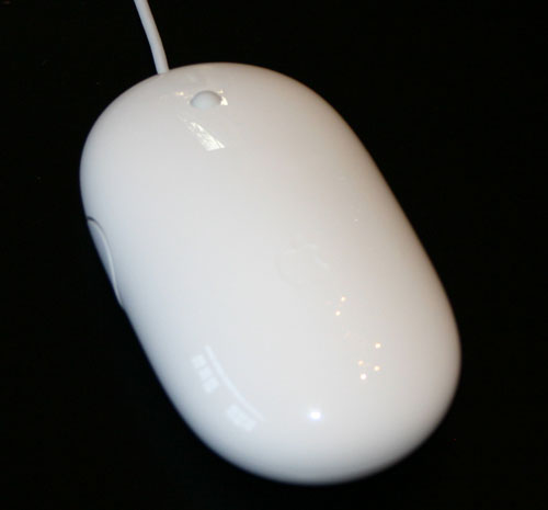
The Mighty Mouse
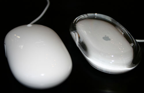
Mighty Mouse (left) vs. Apple Optical Mouse (right)
Apple's one button mice in the past haven't really had a button; rather, the entire surface of the mouse acts as the primary mouse button. Pushing it down makes the mouse click and acts as a left or primary click. The Mighty Mouse works the same way, but there are now touch sensors below the left and right halves of the mouse that sense whether or not you are trying to left or right click. So, although a left and right click mechanically trigger the same button, the sensors below the surface of the mouse determine the sort of a click that you're trying to perform. I'll get to whether or not this actually works well in a moment.
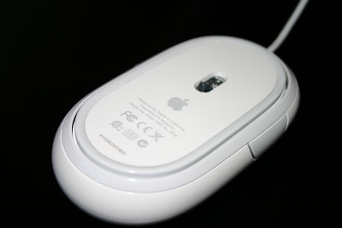
The underbelly of the Mighty Mouse
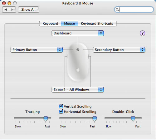
Apple has effectively built the world's first multi-button mouse that's designed to look and work primarily like a one-button mouse. And now it's time to find out if they did a good job in doing so...


45 Comments
View All Comments
LincTX - Saturday, August 6, 2005 - link
I don't think the mouse is the only one with small balls. There is a difference between Professional and just being plain tame. This is a horrible, horrible product that is sure to annoy more than just gamers and PC-switch users.I say pass the Apple product reviews on to a reviewer which hasn't been recently bitten with the Apple worm. It's only fair I think.
cryptonomicon - Friday, August 5, 2005 - link
Logitech or microsoft are not perfectly ergonomic and do not fit many people's hands, however they are infinately more ergonomic than this attempt by apple.Why can't apple just put two buttons on the top of their mouse??? The bottom-clicking mechanism is an overly complicated way for a mouse to work and causes alot more accidental clicks in my experience.
Vitaboy - Friday, August 5, 2005 - link
By the content of most of the comments here, it seems you have a lot of people who feel very threatened by the Mighty Mouse.
It seems Anand's review was very objective. He pointed out the mouse's good features as well as the bad features. In the end, he basically stated the mouse is certainly appropriate for some people (like Apple Pro Mouse users) but not so great for others (gamers and hardcore multi-button mousers). Yet, a lot of people seem to be very threatened by this seemingly sensible language with comments like, "This proves the mouse sucks!" or "Apple is all style, no function!" when it's clear most of the people posting have not used the mouse, do not have an open mind, and do not even care to have an open mind about it.
I've tried the mouse. The mouse isn't perfect, but it's perfectly good enough for most Mac users and probably a lot of less experienced Windows users. It feels comfortable to my hands and is thus "ergonomic" for my needs. Considering most companies slap the term "ergonomic" as nothing more than a marketing label to make consumers think they are getting "ergonomic" without really explaining why their product is so "ergonomic" (like the marketing guy that Dilbert needles by explaining what he means by "paradigm"), it seems to me the only definition of ergonomic is something that doesn't cause you discomfort or pain after use. And that, it seems, is a very personal thing rather than Microsoft, Logitech, or Apple telling me that their mouse is "ergonomic."
That being said, for every comment of "It's amazing how much Apple can get people to pay for useless style", you can always find someone who feels threatened by the idea that there are many people out there who find that Apple products work for them just fine.
The bottom line? Some users will love Might Mouse because it works well for them. Many other will not like it one bit. But everyone would benefit from the discontinuation of inane and childish mentality of "I think the mouse sucks and you are getting ripped off if you buy because I hate it and I know better than you and you should use what I think is better because Apple sucks." Nuff said.
IKeelU - Saturday, August 6, 2005 - link
I don't feel threatened by apple's products. It just seems arrogant to me that a company would forsake ergonomics and functionality just to be "different". Granted, I don't actually know why apple chose this design, but from Anand's reactions to the product, I can't see any other reason why someone would want to buy it.MCSim - Saturday, August 6, 2005 - link
Mighty Mouse is one way to say "we don't want to expand to gaming". If it only works in simple use, there's no way it would become popural outside of Apple fanatics or "we don't know anything else".My MX700 is ergonomic, can use it anyway i want, doesn't have same kind of limitations as MM, can use it with Mac's and PC's.
MM is just bling bling. There's no way telling what it causes in long periods of time to your hand. Only Apple can deliver this kind of "limited" usage products, because it's "cool".
As you said, most Mac users are a lot less experienced than the Windows users. My friend once told me a joke, simple computers for the simple users. He was just being sarcastic. :)
kmmatney - Friday, August 5, 2005 - link
Well, I think this mouse sucks. I also thought the "hockey puck" mouse sucked on the old imacs. I don't think they make the old hockey puck mouse, because, well, it sucked. This one seems way to easy to miss the clicks. The market will show how long this mouse lasts in its current form. I bet it won't go over all that well.Ocaid - Friday, August 5, 2005 - link
Amen.cryptonomicon - Friday, August 5, 2005 - link
" This is a case where I really think Apple has sacrificed usability in order to achieve aesthetic elegance."Yep. This mouse sucks. I feel sorry for the people who are going to use it.
SMOGZINN - Friday, August 5, 2005 - link
It seems to me that this mouse was created for the type of people that move the mouse over the icon and then pick up their hand and click with one finger. You know the same people that type with one finger, probably the same finger that they click the mouse with. I often think that Apple does not take their customers seriously, and makes systems designed for the lest common denominator. This is a shame because they often have really interesting ideas, and I would like to be able to get a system that does not look like it was designed for a 14 year old's room like the all plastic 'ninja' cases or a warehouse (flat metal case, beige case.)Houdani - Friday, August 5, 2005 - link
Mind you, I'm not bellyaching for the sake of bellyaching. This is a case where I really think Apple has sacrificed usability in order to achieve aesthetic elegance.I totally wouldn't be surprised if prolonged use of this mouse didn't cause significant musculoskeletal disorders (MSD) due to the unnatural way you have to manipulate your hand in order to use the mouse. Quite seriously, I expect users of this mouse to enjoy the pleasures of Tennis Elbow -- and they probably won't even realize it's the mouse which is causing it.
This mouse is a failure in the sense that in order to use it, you have to do unnatural things with your hand. Yes, you can "get used to it" but that's hardly any reason to excuse it's flawed implementation.
>> You should not have to physically lift one finger in order to click with another.
>> You should not have to pinch with your thumb and pinky in order to use the side buttons. Hello thumb button!
>> Moreover, you should not have to reposition your entire hand in order to use the side buttons.
>> You should not have to apply pressure to the trackball in order to use it. That's just unnecessary strain.
>> When using the trackball, you should not have to repeatedly move your fingers in a contorted manner (while exerting a slight amount of downward pressure) just to get to the other side of the document. Anand has me thinking the "high scroll rate" isn't all that high a rate.
On a side note, what happens when you click the trackball when either of your fingers is resting on the mouse? Do you have to physically remove your fingers from the left and right "buttons" in order to get a trackball click?